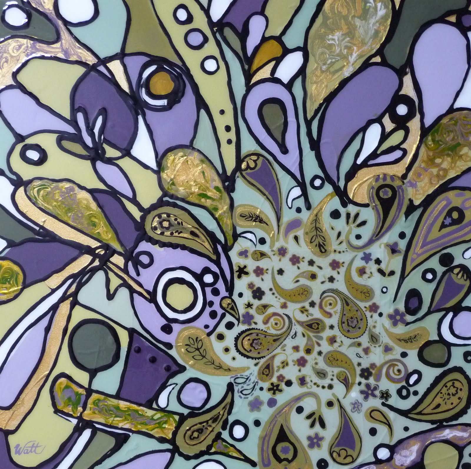
Information Processing
24x24"
Acrylic on Canvas
Painting #41 - My daily paintings have become a little bigger that usual and they are taking more than a day to complete. I've decided to produce a body of abstract paintings for the following reasons:
- to motivate and stimulate my creativity
- to further develop my artistic skills
- to develop my own style, originality, individuality
- to invoke my feelings, intuition, spontaneity, inventiveness and feeling for colour, shape, composition, etc.
- the process will help me learn how to interpret reality better